We made some major upgrades to our smart driving app, so we asked our Director of Product Design, Matt Stein, to share the inspiration behind everything.
I’m excited to see the newly redesigned Metromile app in the wild today, now available on iOS and Android. The primary goals of the redesign were to create a foundation that could be built on in the future, delight our growing user base, and provide the best experience possible for getting a holistic view of everything to do with your car.
A key component of the redesign process was understanding how the current app was being used. We ran a focused qualitative user study as well as a broader quantitative survey to give insight into what was working well and what could be improved. The primary theme was that our users want to have peace of mind about their car. They want to know where they last parked, what an engine light means, and the ability to dig into the details on a recent trip.
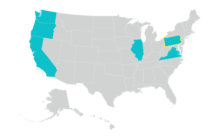
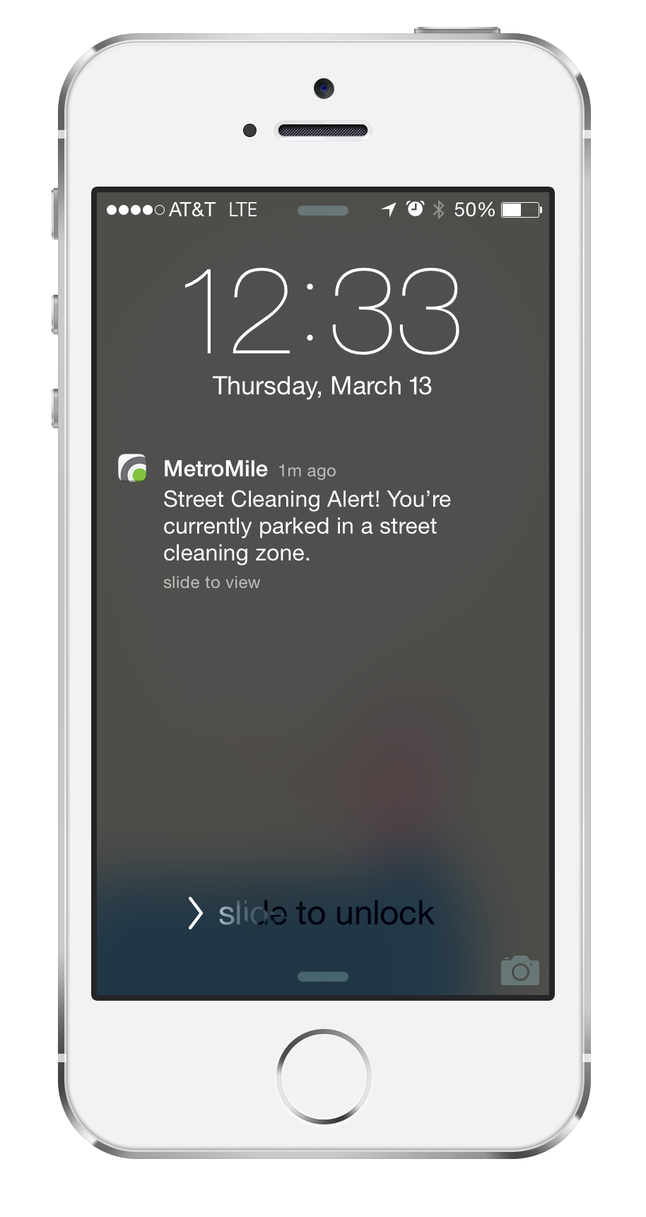
The Metromile app can be used by either our per-mile insurance customers or people who use the free app version. The app will track your trips, show you where you’re parked and alert you to street sweeping (select cities). For insurance customers, it decodes engine code warnings and allows them to contact our in-house mechanic.
All of the aforementioned features are fairly distinct, and one of the challenges in designing the app was coming up with a consistent pattern for the user to consume information, such as viewing trips, decoding warnings, or understanding how to get roadside assistance.
The following three principles guided the design:
- Create a scalable framework
- Provide information at a glance
- Make it fun
Create a scalable framework.
The app itself is split across four distinct areas: Car Health, Parking, Trips and Insurance. These four areas are displayed on the app’s main view via separate cards that allow the user to drill into a more detailed view. Because most of the app’s features are distinct and don’t overlap (e.g. Trips won’t overlap with Car Health), this design choice gave us the most flexibility when considering new product capabilities. Although our app contains a hamburger menu, it is mostly supplementary because 80% of the app’s functionality can be accessed through the overview. Settings and vehicle switching are the two exceptions.
One of the biggest challenges was ensuring the same design framework could be used across each view. After exploring various options, the team arrived at a card pattern that is fairly prevalent today. Users understand how to interact with cards, and they are easily accessible. Each of the primary views has a “hero” section highlighting the most important information as well as child cards that allow the user to dive deeper into an area. …